Advertising
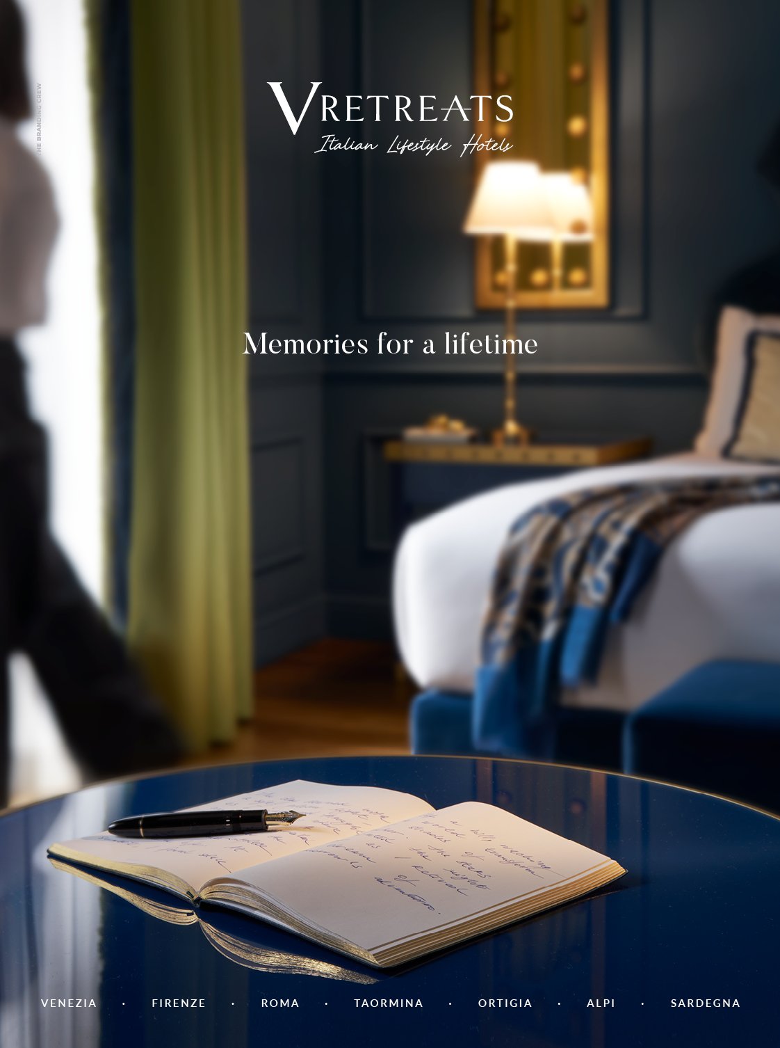
VRetreats has also relied on us for the creation of their new branding campaign. A shot that encapsulates the essence of the chain, that of unmistakable Italian hospitality, with an evocative message: Memories for a lifetime.
Front and center is an open diary just annotated with the suggestions of the day just passed, destined to become indelible memories.
This is precisely what VRetreats promises: to make every single moment of a stay memorable.
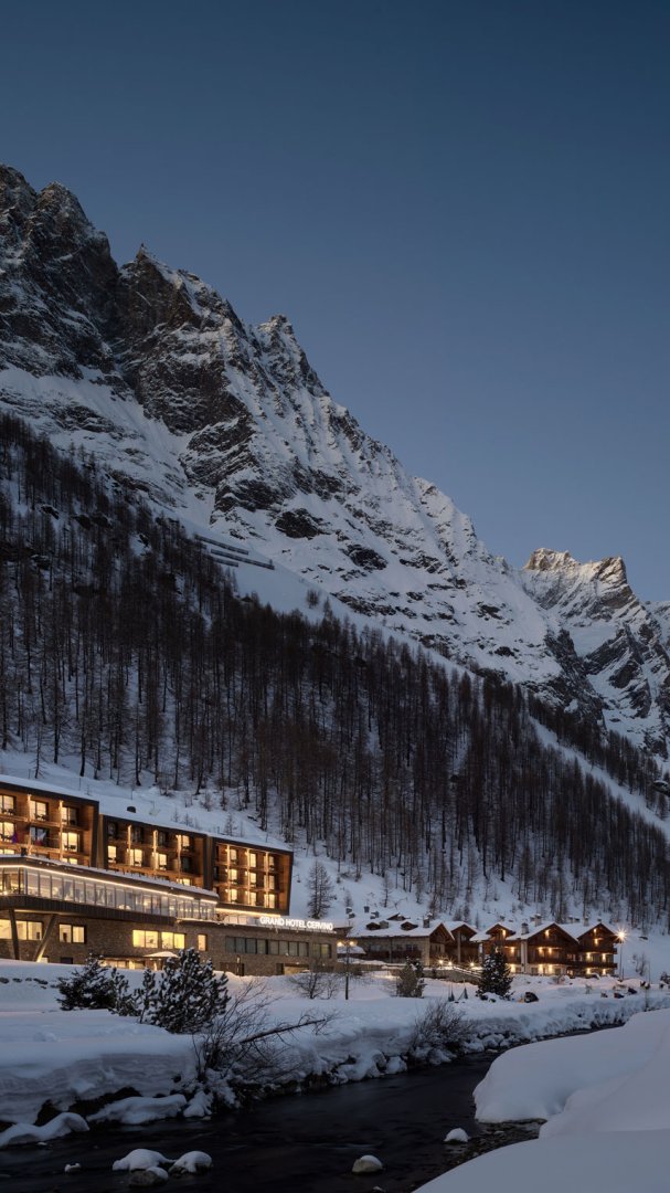
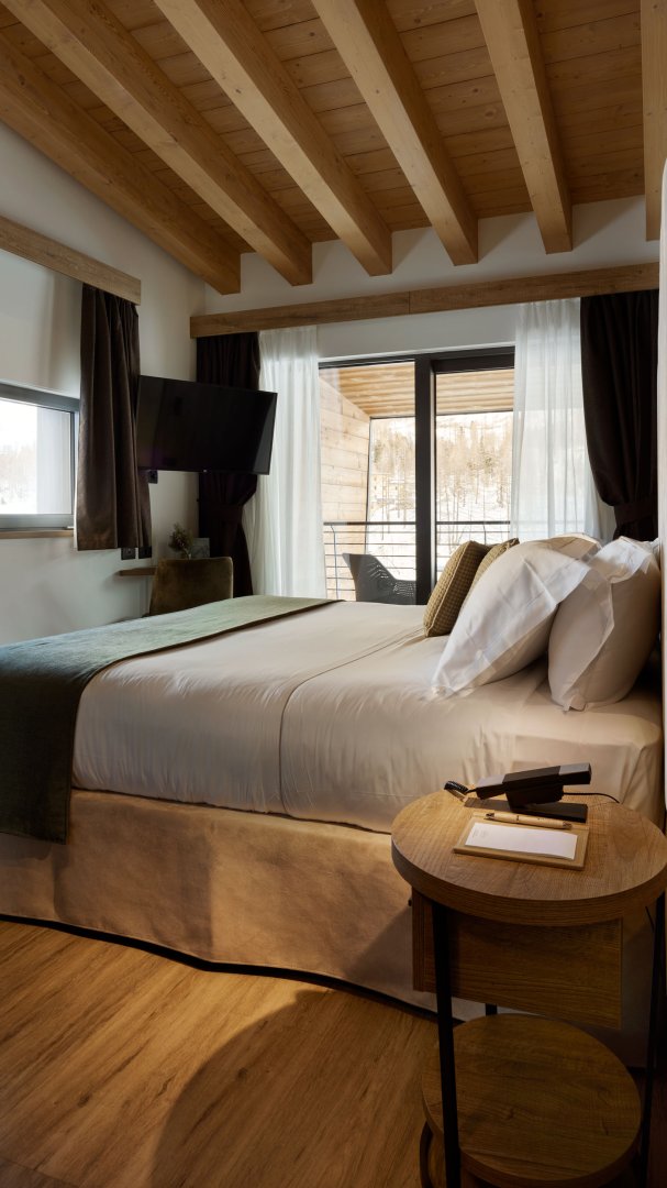
VRetreats Cervino - Production
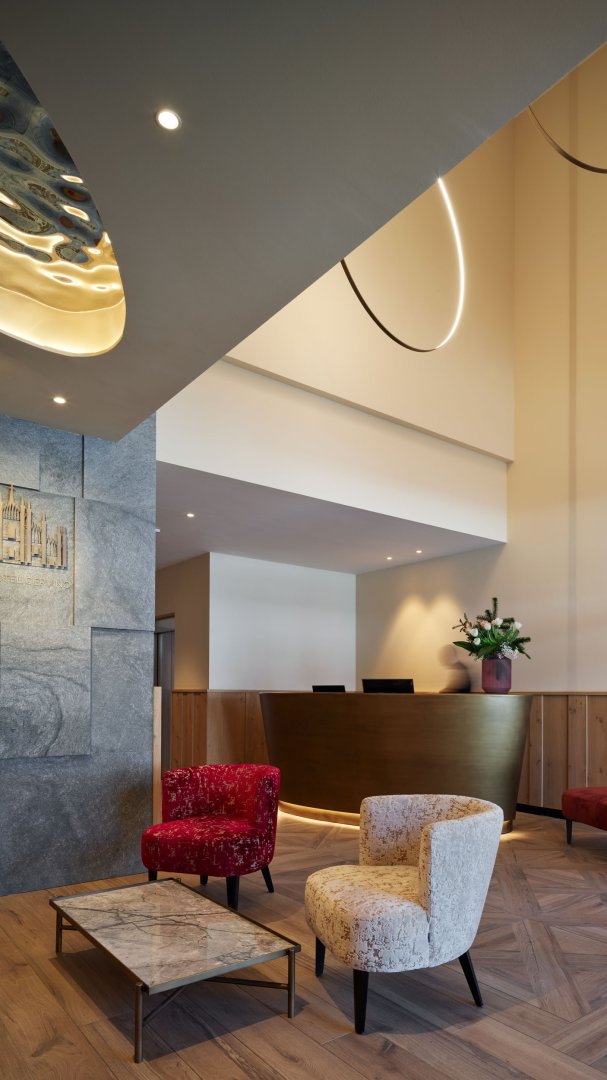
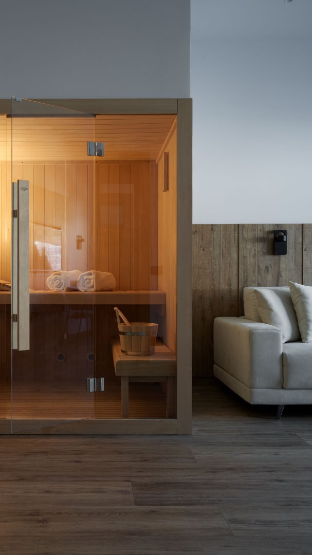
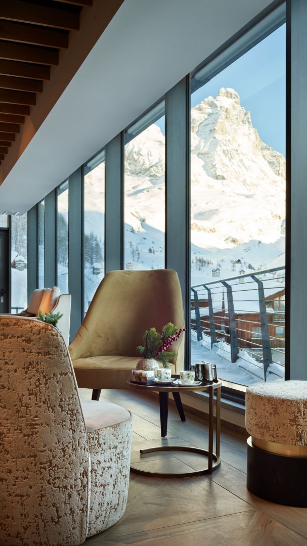
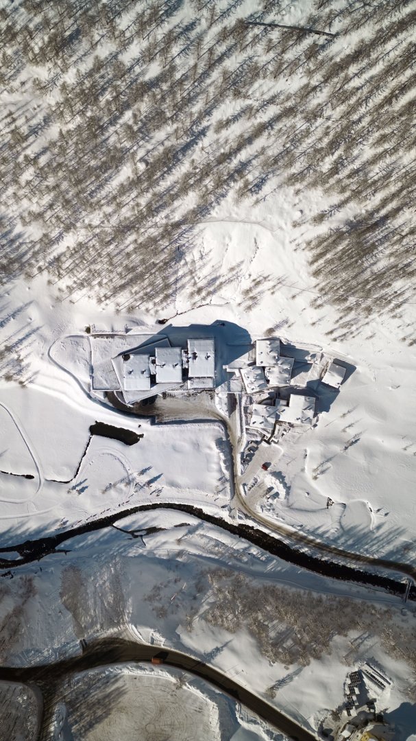
A production organized and realized for one of the VRetreats facilities in the heart of the Alps.
The Matterhorn mountain provides the backdrop for this charming hotel where, on the occasion of the campaign shoot, we created some evocative images to better describe its atmosphere.
Vero - Branding
Our intervention also included naming, logo design and definition of the coordinated image for the restaurant in Ca' di Dio. The name VERO contains a whole philosophy made of flavors, typical and genuine ingredients, distinctive elements typical of the territory. VERO is also the acronym of Venetian Roots, or those Venetian roots that we can find both in every design element and in every dish.
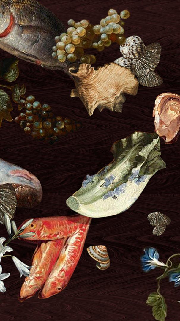
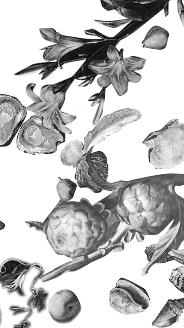
Like the ingredients, the coordinated image follows the rhythm of the seasons. In winter we have as a background the colorful illustration chosen for the interior ceiling of the restaurant that, in summer, turns into an elegant black and white embellished with the same hot bronze foil.
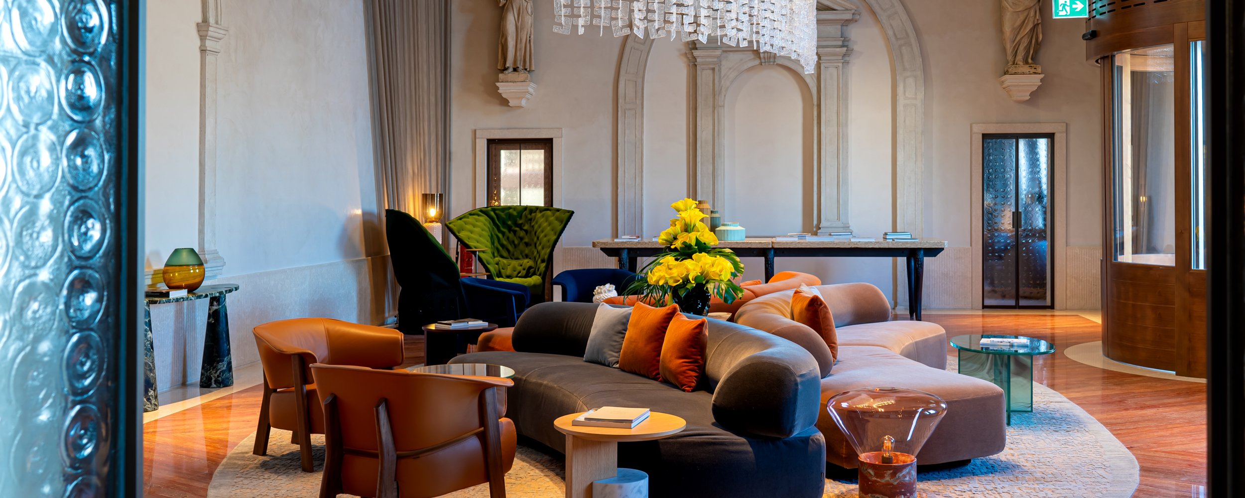
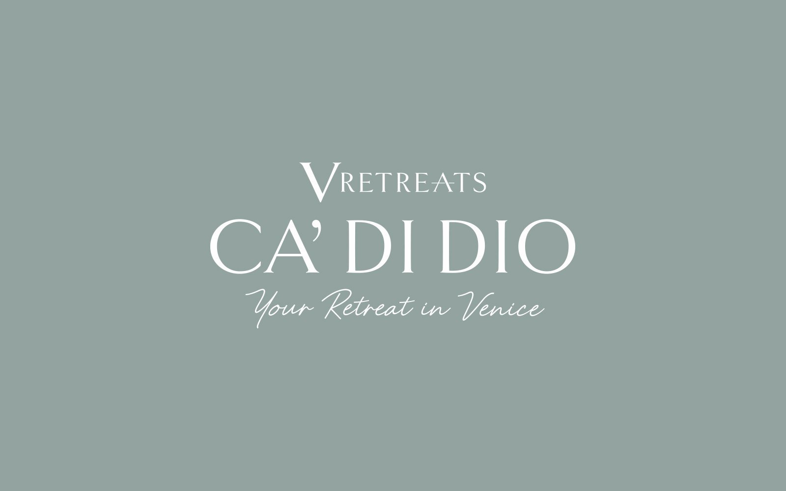
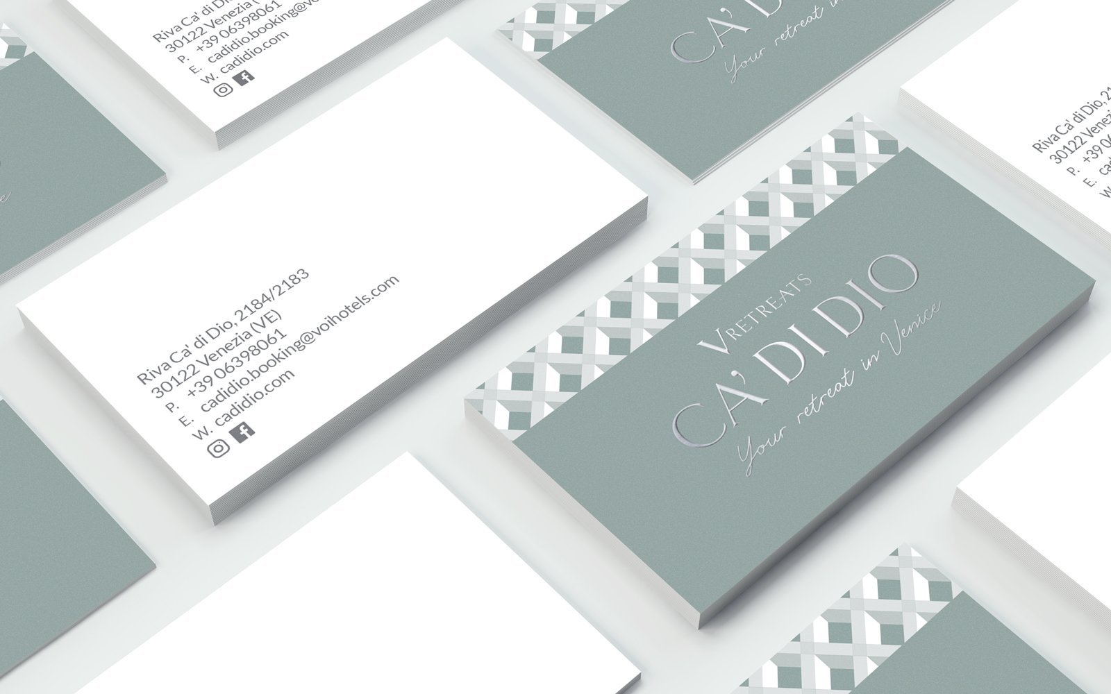
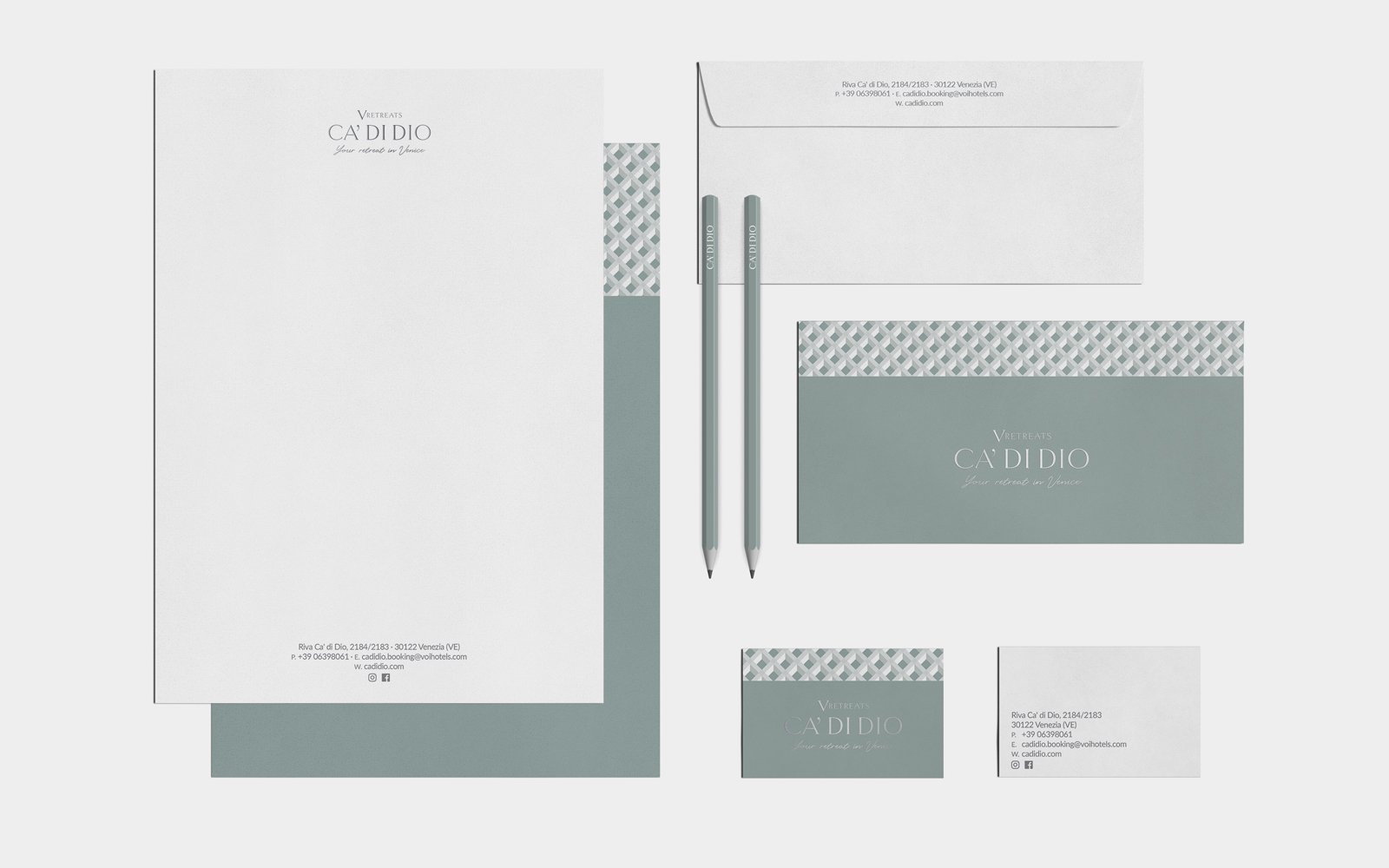
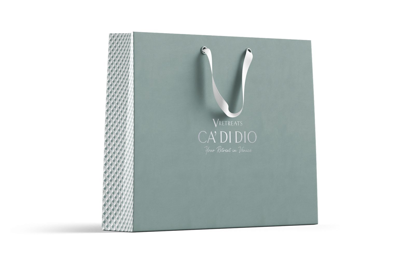
VRetreats Ca' di Dio - Branding
Part of the VRetreats collection is also Ca' di Dio, the new 5 stars in Venice unique in its position and structure, protagonist of an exclusive restoration project by Patricia Urquiola.
As for the other hotels, an exclusive texture was designed that recalls the uniqueness of the individual destinations and was used to define the various communication tools of the structure.
Branding
An important rebranding operation for the leisure-oriented hotel chain of the Alpitour Group. What was formerly known as Lifestyle VOIhotels is now VRetreats. Our intervention has given rise to a new name that immediately evokes the collection of exclusive residences in some of Italy's most picturesque destinations.
In addition to the naming, we have also devised a tagline to best convey the authentic Italian lifestyle that can be experienced within these oases of tranquility. The new logo visually encapsulates this unmistakable essence of Italy.
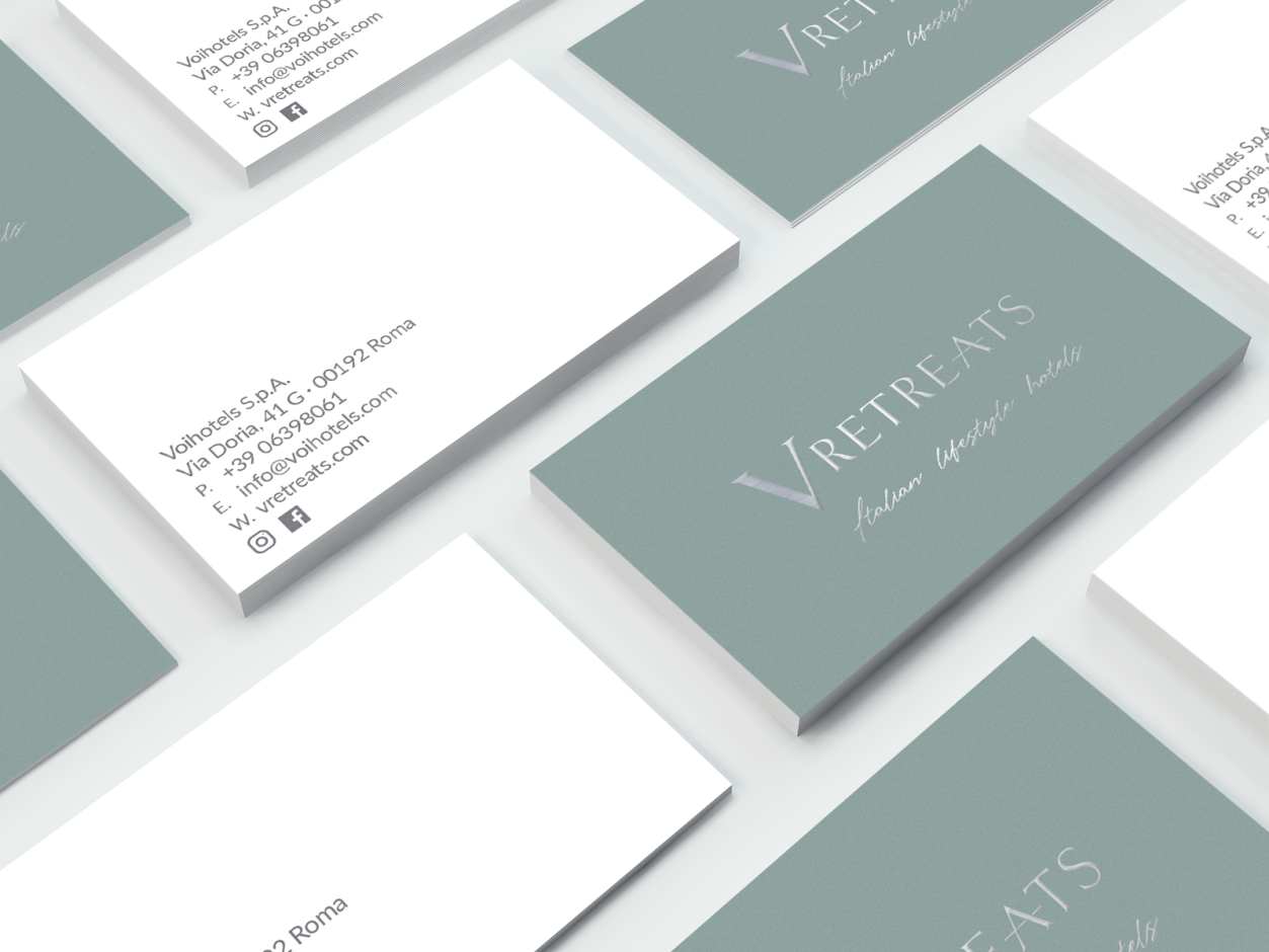
We chose a palette color characterized by a particular pastel color and selected a Fedrigoni paper certified FSC by the precious and natural hand. The silver hot foil embellishes a coordinated image consistent with the message of exclusivity that the brand wants to convey.